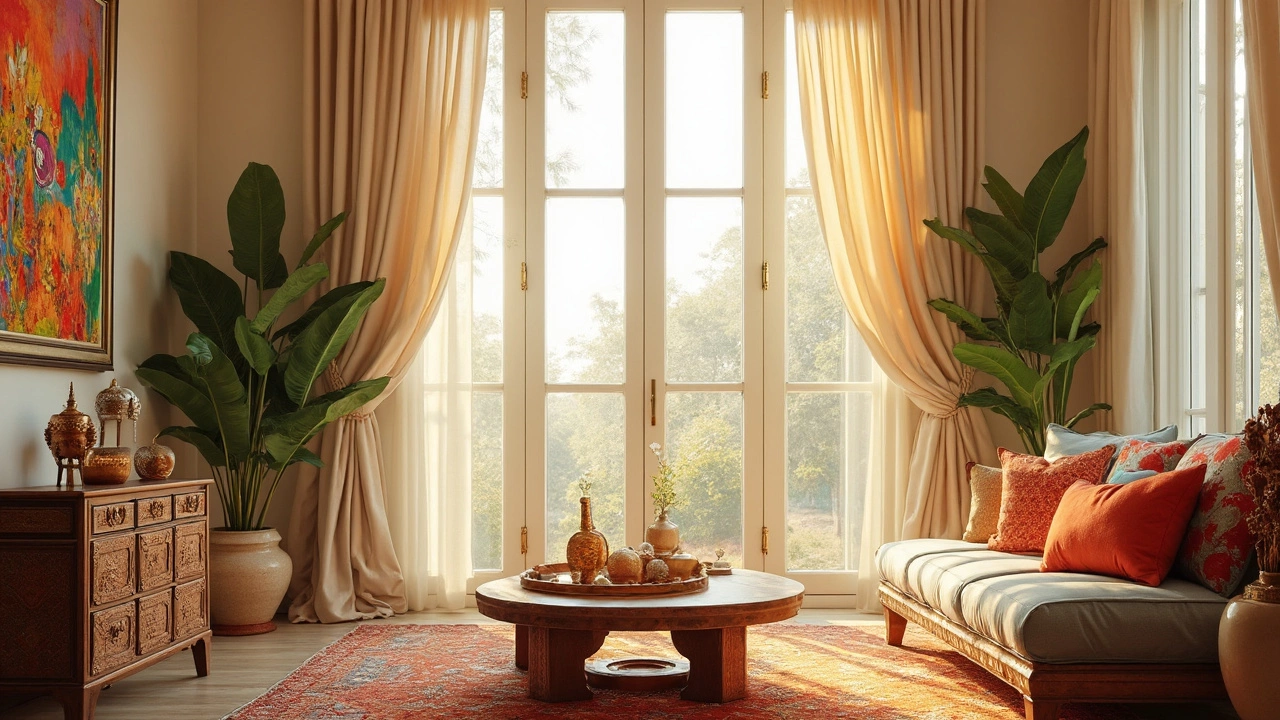
Most Common Curtain Color: Why Neutrals Rule Windows
Ever wondered which curtain color tops the charts in homes everywhere? This article breaks down the most common curtain color, uncovers why it’s everywhere, and shares some insider tips for using it in your space. You’ll find out how this color fits with different styles, what makes it a practical choice, and when to try something different. Plus, get advice on keeping it fresh so your windows always look modern.
View More