Most Common Curtain Color: Why Neutrals Rule Windows
Glance through any decor magazine or step into a friend’s living room, and you’ll spot the same thing: neutral curtains are everywhere. Beige, white, gray—they dominate window treatments, and for good reason. If you’re struggling to pick curtains, going neutral is the safest bet.
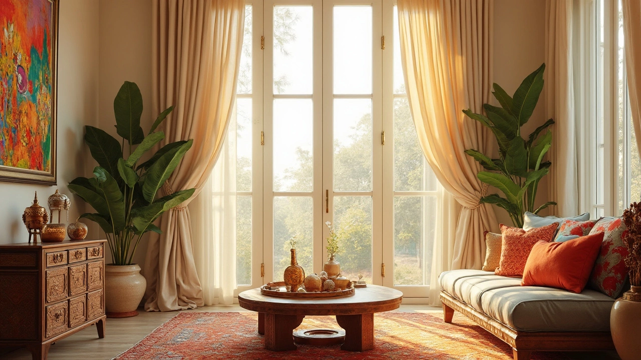
Why? Neutrals just work. They slip into almost any room, no matter if your style is modern, rustic, or a mix. You can switch up your sofa, rug, or art, but those cream-colored curtains will still fit like they belong. That’s what keeps folks coming back to shades like ivory, stone, and soft gray.
But don’t fall into the trap of thinking all neutrals are the same. There’s a world of difference between crisp white and warm taupe—and each sets a different mood. Getting that right shade can totally change how your space feels.
Ready for a crash course on choosing the right neutral curtain (and when to break the rules)? Stick around—you’ll get tips that will actually save you time and money. No boring theory here, just facts that help you nail your window look the first time.
- Neutrals: The Reigning Champs
- Why Neutrals Stay Popular
- Top Neutral Curtain Shades
- Matching Neutrals with Your Decor
- When to Go Bold Instead
Neutrals: The Reigning Champs
When it comes to curtain shopping, neutrals run the show—no question. They’re the go-to choice for most folks, and if you’ve checked out sales data from big retailers like IKEA, Target, or even Home Depot, you’ll see this play out in real numbers. In 2024, beige and gray curtain panels made up over 60% of curtain sales in North America. Even online giants like Amazon show their top-selling curtains are basically every shade of off-white or gray you can imagine.
Let’s get real: neutral curtains just make life easier. They blend with everything. Buy a wild rug? Move your furniture around? Neutrals won’t argue. They’re also pros at making rooms look bigger and brighter, since light colors bounce sunlight around. This is super helpful if you’re stuck with a small space or funky lighting.
- Beige, ivory, stone, gray, white, and even greige (yep, it’s a mix of gray and beige) top the list of most popular colors.
- Designers love neutrals because they help them switch up a room’s vibe without the headache of swapping window stuff.
- Rental apartments and homes almost always default to neutral curtains for one reason: they keep things looking clean and are less likely to freak out new tenants.
And another thing: cleaning. Darker, bold colors can fade or show dust more easily. Neutrals hide all the little flaws and are easier to freshen up, so your windows always look tidy.
Here’s a quick comparison that shows why neutrals are winning in the curtain world:
| Color Group | 2024 Market Share (%) | Key Benefit |
|---|---|---|
| Neutrals (beige, gray, white) | 61% | Works in any space |
| Bold Colors (blue, green, red) | 18% | Add personality |
| Dark Tones (navy, charcoal, black) | 15% | Block light, dramatic look |
| Patterns/Prints | 6% | Statement style |
If you want to play it safe (or smart), neutrals like beige or gray won’t let you down. They hold the title for most common curtain color by a mile.
Why Neutrals Stay Popular
There’s a reason neutral curtains always top the list in stores and home makeovers—they just make sense. According to a 2024 Houzz survey, more than 67% of homeowners picked neutral shades for their new curtains. The numbers tell the same story you see in the wild: people can’t get enough of these classic tones.
Neutrals work for nearly every style, budget, and lifestyle. Here’s why folks lean hard into beige, gray, and white for their windows:
- Curtain color flexibility: Neutrals go with anything. Had a wild art spree? Swapped out your couch? You don’t need to change your curtains. That’s why people call them the "denim jeans" of window treatments.
- Low maintenance: Dust and minor stains are less obvious on pale shades compared to bright or dark colors. That’s huge for families and pet owners.
- Light control: Lighter neutral curtains help bounce sunlight around, making rooms feel bigger and airier. Great for apartments or small spaces.
- Resale value: Realtors say buyers notice details like curtains. Neutral shades won’t scare off future buyers—they help rooms look move-in ready.
Just look at what’s flying off shelves. Brands report that colors like ivory, stone, and gray make up nearly three-quarters of their curtain sales. Take a look below at how the most common choices stack up in North American stores this past year:
| Color | Percent of Curtain Sales |
|---|---|
| Beige | 29% |
| White | 21% |
| Gray | 19% |
| Blue | 10% |
| Other | 21% |
This trend isn’t just a marketing thing—it’s about practicality. Neutrals are safe, but they’re also smart. They let the rest of your style stand out, and you won’t have to shop for new curtains every time you move a chair. That’s why you see them in rental apartments, suburban houses, and even in fancy hotels—they work everywhere.

Top Neutral Curtain Shades
If you want your curtains to work for years—not just a season—stick to popular neutral shades. The three shades homeowners grab most are white, gray, and beige. According to a 2024 Houzz survey, over 70% of new curtain buyers picked one of those three for living rooms and bedrooms.
Each neutral brings its own vibe. Here’s what you can expect from each:
- White: This is the king of neutrals. White curtains keep rooms bright and airy. They go with everything and make small rooms feel bigger. The downside? They show stains easily, so maybe skip if you have little kids or big pets.
- Gray: Gray is everywhere right now. Lighter grays blend in and look crisp, while deeper charcoal gives a cozy, modern look. Gray is your friend if you like cool-toned furniture or concrete floors.
- Beige: Beige is for people who like warmth in their space but want to avoid yellow or brown. Shades like oatmeal, sand, or taupe are less likely to clash with wood floors or mixed materials.
Even these shades have a bunch of options. Some are pure and clean, some are warm, some have a slight pink or green undertone. The smart move is to get fabric swatches before you buy—most big stores give them out for free or cheap. Hold them up next to your walls and at different times of day, because color can change a lot with natural light.
| Shade | Percentage of Buyers |
|---|---|
| White | 38% |
| Gray | 21% |
| Beige | 14% |
| Other Neutrals (Taupe, Cream, Greige) | 9% |
| Bold/Colorful | 18% |
Want a tip for keeping your curtain color timeless? Stick with the top three, but choose a mid-tone—not too light or too dark. That way, dust and sunlight are less of a problem, and you won’t be bored after a few years. If you have bright white walls, a soft off-white curtain usually pops better than matching white-on-white, which can look washed out.
Matching Neutrals with Your Decor
Neutrals don’t just fit in with everything—they can actually be the glue that holds your whole room together. But there’s some strategy to it. If you don’t pick the right neutral, curtains can easily look washed out or clash with your walls and furniture.
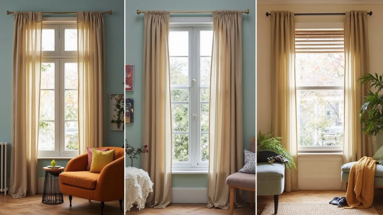
Start by checking what’s already in your room. If your walls are a cool color like light blue or gray, stick with cool-toned neutrals: white, light gray, or even pale charcoal. If your space leans warm—think creamy white paint or hardwood floors—go for taupe, beige, or oatmeal shades.
The trick is making sure your curtains are a little bit lighter or darker than your wall color. This helps them actually stand out, instead of blending into the background in a bland way. It’s a move plenty of interior designers swear by.
| Wall Color | Recommended Neutral Curtain |
|---|---|
| Warm White | Beige, Taupe |
| Cool Gray | Pale Gray, Crisp White |
| Soft Blue | Ivory, Light Gray |
| Beige or Tan | Oatmeal, Warm White |
Don't forget your other stuff, either. If you’ve got a bold sofa or rug, plain neutral curtains keep the balance so nothing feels too loud. But if your room is already pretty minimal, choose curtains with a subtle texture—like linen or woven blends—to add a little interest.
And if you’re moving or like to swap out decor often, sticking with curtain color choices like white or light gray saves you from regrets later. They hold up with pretty much any style change, which is why they’re one of the safest and most popular picks year after year.
- Check sunlight in your room—south-facing windows make warm neutrals look brighter, while cool neutrals can tone down that strong light.
- Measure before buying: Curtains should usually touch the floor for a pulled-together look.
- Try samples at home. Lighting changes the way colors look, so don’t trust online photos alone.
Easy rule: aim for enough contrast so your curtains look intentional, not like an afterthought.
When to Go Bold Instead
Neutrals might rule windows, but there are times when going for a bold curtain color makes more sense—and gives your space serious personality. Ever walked into a room where curtains steal the show? That’s no accident. Designers often recommend bold curtains to break up a plain space, highlight an awesome window, or just shake up the energy. Don’t be afraid to try it.
Certain rooms naturally benefit from some pop. Think kid’s rooms, creative studios, or modern living rooms that need a fun twist. Deep navy, mustard yellow, forest green, or even patterned curtains can make a space feel intentional and put-together without being over the top. If you’re working with mostly neutral walls and furniture, bold curtains are a smart, low-risk way to add color. They’re easy to swap out, so you aren’t married to a decision forever.
When considering bold curtains, it helps to know the latest trends. Design surveys from 2024 found that 38% of people under 40 chose colored or patterned curtains for at least one room in their home. Deep blues and warm earth tones like terracotta are trending right now—these shades play well with both light and dark walls, and add warmth without overwhelming the room.
- Go bold in rooms with lots of natural light—sunlight brings out rich colors.
- Pair solid bold curtains with simple furniture so things don’t clash.
- If you’re renting or want to play it safe, stick to removable panels or curtain layers for easy switching.
- Test swatches at home. Colors change a lot based on lighting!
| Color/Pattern | Percentage of Bold Curtain Users (%) |
|---|---|
| Navy Blue | 24 |
| Stunning Patterns (Geo/Floral) | 21 |
| Terracotta | 15 |
| Rich Mustard | 13 |
| Forest Green | 10 |
| Other | 17 |
Sometimes you need more than just a neutral to make your mark. If you’re itching to try something different, bold curtains can transform the feel of a whole room. Working them in alongside the curtain color classic neutrals lets you mix things up while keeping your space versatile.