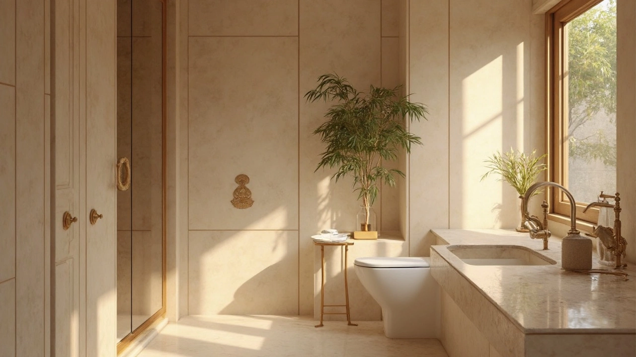
What Bathroom Color Sells the Best?
Selecting the right bathroom color can significantly influence the sale of a home. Neutral tones tend to attract more buyers, while bold colors can sometimes deter them. The psychology of color plays a critical role in making the bathroom appealing. This article explores which hues are the most successful in enhancing a home's market value.
View More